Fujifilm X-E3 Review
GUEST POST FEATURE
Write Your Articles Directly On FujiRumors!
Guest Post by The Overrated Photographer. You can follow him on instagram or on his website
Introduction
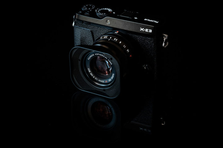
The Fujifilm X-E3 is Fuji’s fourth iteration of the X-E series camera. It was the X-E1, X-E2, X-E2S and now the X-E3 (although I stand corrected if I missed one). I’d love to say my journey started with the X-E1, but back in those days, I was in Nikonland oblivious to the world of mirrorless. Some hardened Fujifilm users would say I haven’t paid my dues. My journey in the X-E series started with the X-E2s and despite it being a great camera, it’s been a little frustrating for me, in part because I also had an X-T2. I liked the image quality but I wasn’t using it much for a couple of reasons:
- The AF was not great coming from DSLR’s, it’s only really with the arrival of the X-Pro/X-T2 that we saw DSLR like AF performance.
- The button layout was poor compared to the X-T2 – It was probably good at the time it was released, I think I was spoilt by the X-T2 and that made the X-E2s experience seem substandard. It was simply too hard to do what I wanted coming from the X-T2.
- I miss Acros whenever I use it – Acros is one of my favourite film simulations so having access on the X-T2 and no Acros on the X-E2S meant more often than not I’d be reaching for the X-T2 over the X-E2S despite it’s smaller size.
- I miss the joystick from my X-T2 – For AF, the joystick is a pleasure to work with and having worked with the X-T2, I find it hard to shift back to my X-E2S or X100T.
When I started looking at a replacement for my X-E2S, I looked at the X-T20, but the joystick was missing from the camera.
For a period of time, I was stuck on the choice between the X-T20, another X-T2 and perhaps even an X-Pro2 as a second body. I’d given up on the X-E3 as the X-T20 didn’t have a joystick so why would the X-E3 have one?
Fortunately it turns out I was wrong but the choice still wasn’t a foregone conclusion: It came with the joystick, but minus the tilt screen and minus the D-Pad. The lack of tilt screen I could live with as I could use my X-T2 for that, the lack of D Pad I wasn’t so sure about. As I started looking at the videos of the X-E3, I realised it may not be that big an issue if Fujifilm was right about their implementation of the touch screen so I decided to give it a try.

Pricing
The US retailer price is US$899 or about AUD$1300 in Australia (where I live). I picked mine up at CameraPro who seemed to be one of the first with stock of black X-E3’s. It’s fairly reasonable pricing given the specs and performance. The X-E3 also comes with two kit lens options, a XF23mmF2 or XF18-55mmF2.8-4 option, both of which are very good lenses and not “kit” lenses in the conventional sense of the word. I’d highly recommend considering one of these options if you don’t have either lens.
Packaging and Contents
Packaging is not dissimilar to any of the other Fujifilm products. Tasteful and upmarket, nothing looks cheap and nasty. All the items in the box are packaged upside down if you’re a complete idiot like me and open the wrong side of the box.
With the X-E3 you get the following (other than the box):
- Camera
- Charger and power cable
- Single W126S battery
- External Flash
- Strap
- Manuals and Warranties
There are two thing I find confusing about Fujifilm:
- The lack of micro-USB in the box – I understand Fujifilm’s logic may consider that most people would have one at home, but if I was about to buy one at an airport, climb on a plane and go on holiday, there is a chance I may not have one with me and most people would expect to find one in the box.
- The lack of flash hotshoe cover – this would cost them all of about 10 cents for a little plastic hotshoe cover. Why don’t they include it?
Construction
The X-E3 is positioned somewhere between the entry level bodies like the X-A3 and the pro bodies like the X-Pro 2. The X-E3 feels more solid than my old X-E2S, but this could be new camera fever. The construction on the camera is still great and it still retains the cold metal feel you are accustomed to with Fujifilm.
Fujifilm have removed the built in flash in favour of the small external flash provided with the X-T2. Some users will be annoyed about this but I’m not one of them. On camera flash generally looks somewhere between terrible and horrible so if you are using it, I’d recommend buying a Godox TT350F as a starting point to get away from it.
Fuji has continued with their obscure decision to position the tripod screw right next to the battery door, however, this time they’ve tried harder to see if they can get the two as close as humanly possibly. This rules out the use of any form of plate unless you’re the sort of user who charges their battery in camera and never needs to change it. Given the battery life on mirrorless, I don’t see that happening for me. My spiderlight is not compatible with the X-E3 and it will be a problem for users of other plates (wimberly, peak design etc). I think it’s a little crazy to have to buy the $100 grip plate due to what I consider a design flaw, although there should be some cheaper aftermarket alternatives soon.
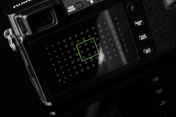
Features and Controls
Key changes that are visually noticeable are:
- The joystick has been added to the camera
- The camera is slightly smaller
- The built in flash has been removed
- The D Pad has been removed.
- Front Dial has been added to the X-E3
Under the surface, there are obviously much bigger changes with the inclusion of the upgraded AF system from the newer cameras and the 24MP X Trans 3 sensor. There is still no weather sealing on the X-E3 although it will handle light rain (don’t sue me if it doesn’t though).
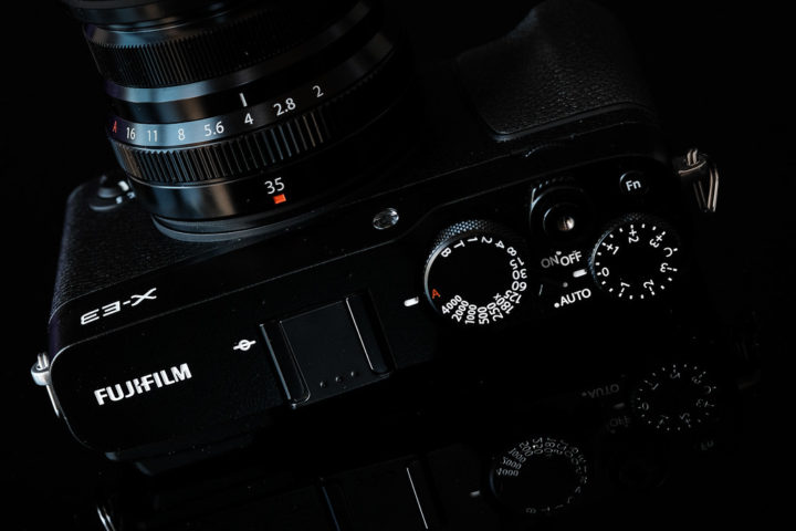
Front and rear dials are great, both incorporate buttons as we see on the other Fujifilm models. The front allows you to get around the lack of ISO dial so it hasn’t been as big of a concern as I thought it would be.
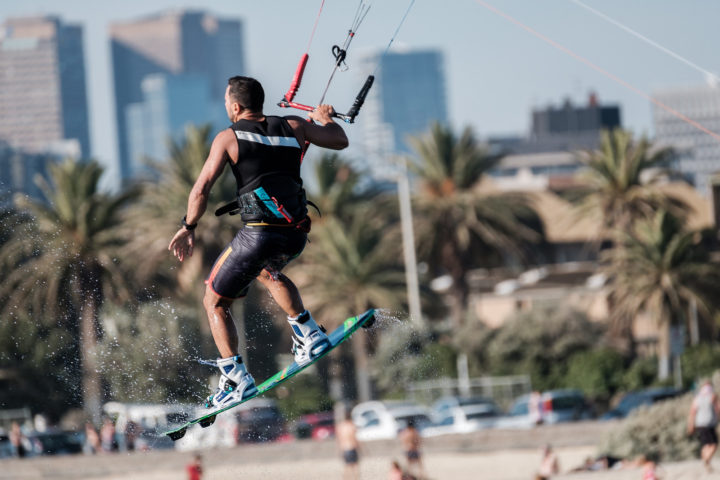
Flash sync speed is limited to 1/180 but with HSS that shouldn’t be much of a problem. The following shot was with the X-E3 and Godox AD200 @ 1/1000.

As with most of the Fujifilm cameras, the back button focus is available to buttons that are so small they required a child sized hands to use them. Please Fujifilm, give us a decent size back button for AF-On so I can stop adding Sugru to my cameras. What Fujifilm has put inside this tiny body with an APSC sensor is amazing. That comes with a lot of pros but it also comes with a couple of negatives.
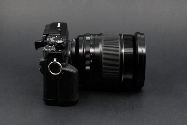
The size of the X-E3 is small, smaller than the X-E2S, smaller than the X100T. With a pancake lens, this camera would be a perfect carry around , with dimensions to match the X100. I suspect there will be many who will be tempted to swap their X100’s for the X-E3, and I think this choice will be made harder if Fujifilm choose to upgrade their pancake lenses at some point in the near future.
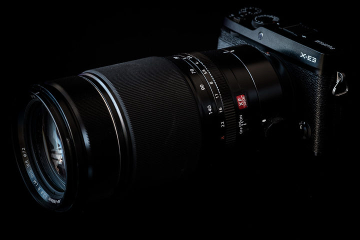
There are some occasions where the size will be a disadvantage, primarily when it comes to working with some of the larger Fujifilm lenses. It also maybe challenging when using these lenses are handed, as I found. I like to hold the camera one handed with a prime whilst holding a speed light in a small soft box with the other hand. With the 90mmF2, it’s quite uncomfortable to hold the camera this way. For those people with bigger hands, adding the grip (or suitable aftermarket alternative) may fix the problem.
I tried the X-E3 with my XF50-140 and the lens dwarfs the camera. It’s not unusable though.
The touch screen
I was a little concerned about the way touch screens have been implemented on cameras in the past. I wasn’t 100% convinced Fuji would get it right given the implementation of the touch screen on the X-T20. Fuji have actually done a great job with this which begs the question “what happened with the X-T20?”. I can only assume it was because it was version one and I’m sure the will be hoping the implementation will be added via a firmware. I would say they got it about 80% right, so if the X-T20 was v1, this is very v2.0 rather than v1.1.
It’s definitely one of the best implementations of a touch screen I’ve seen on a camera. Fujifilm have done well to circumvent the issues as a result of the removal of the D Pad. I think in time, we will see this improve.
The D Pad is circumvented by Fujifilm giving you the ability to flick in particular directions to have the same effect as the D pad. I.e. If you normally pushed the left D Pad button to change film sims, you flick left to bring it up on the touch screen. It’s an extra step but you also reduce steps as you can tap on a specific item rather than using the down arrows.

Now, there have been a couple of videos out about issues with the functionality so it’s probably worth being clear…there are a lot of people that need to read the manual. You need to flick, no swipe. Some would say this is unintuitive, but I think there is a reason why they have done this, namely to avoid unintentional swiping and activation of the menu. I.e. there is a method to the madness. It isn’t quite perfect, so I found it was better to deactivate the “AF by touch” or “photo by touch” when you don’t need it, in my case I would almost never use it anyway. There is a button on the side of the screen that allows for it. I do like that they have enabled the touch screen to move the focus point but I would personally opt for the joystick.
Scrolling through menu’s is a little inconsistent and depending on where you touch the screen, it can jump from top to bottom. I often find myself using the joy stick or rear dial as it’s more consistent.
Autofocus
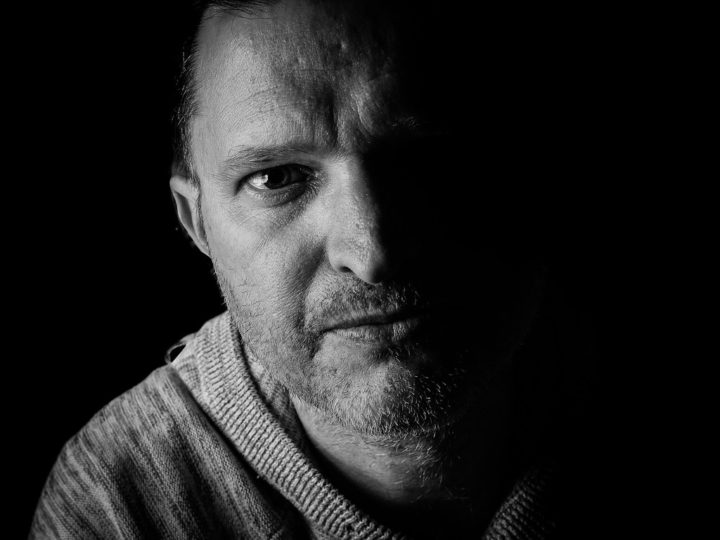
On the surface, the AF system on the X-E3 is the same as the AF Found on the X-T20, which is the AF system on the X-T2 without the ability to customise. It’s a very good AF system and one which will keep most users happy.
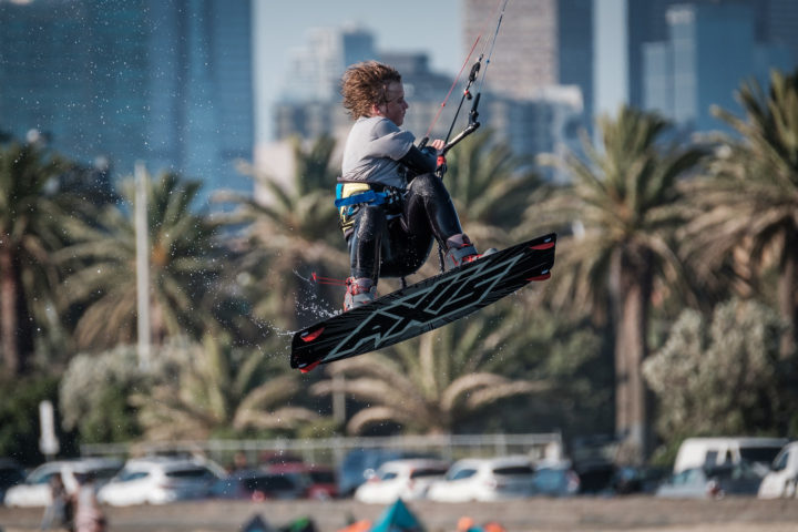
The X-E3 boast some firmware updates over the X-T2 with the arrival of the new AF Firmware that is supposed to make it twice as fast as before. I cannot validate this with cold hard facts, but it definitely seems faster. The big areas I found improvement was AF-C with facial recognition turned on. Before it was almost usable as it would continually hunt, now it seems to be far more stable. For most consumer and enthusiast requirements, the X-E3 will be more than enough. I tested it for some skateboarding and kids and it had no problem keeping up with the action. If you are coming from a DSLR, the AF does take some getting used to. I won’t cover it here, but my Nikon to Fuji switchers guide gives some hints.
If you are planning on shooting anything that has high speed AF requirements, smallest zone works best, but I prefer the accuracy of single point to get eyes in focus with kids.
The EVF
There has been some speculation and complaints about the EVF, more specifically the smaller EVF. I can honestly say that I can’t see the difference compared to the X-E2S. The difference between the X-T2 and X-E3 is noticeable, but not the X-E3 and X-E2S for me personally.
Obviously we’d all like to see a bigger EVF in the X-E3 and X-T20, but the small size comes with constraints and Fujifilm is clearly doing what they can to reduce the size of the camera.
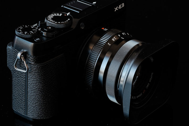
Image Quality
It’s got the X trans 3 so you would expect the IQ to be on a par with the X-T2, X-Pro 2, X100F and X-T20. Image quality is very good and the out of camera JPG’s are Fujifilm usual quality. Noise levels are acceptable up to about ISO3200 with ISO6400 and above only being suitable for black and white or social media sharing.
Given the amount of xtrans sensor review, I haven’t bothered with reviewing the sensor.

Bluetooth
One of the key differences with the X-E3 is the inclusion of bluetooth which is a first for the X-series cameras. I don’t use this type of functionality much, but from what I experienced, it’s far more reliable than the standard connections although it eats battery power at a rapid pace, depending on the option you select, so be careful about sending photos to the camera automatically.
Whilst the battery issue is there, it’s far better than the problem of having to constantly connect to wifi.
I’ll continue to update this section as I get more use out of it and experience more pros and cons.

So what are my issues with the camera?
Obviously no camera is perfect so what are my issues?
- Lack of tilt screen – whilst I personally don’t mind the lack of tilt screen, I understand why people would be upset if this was their solecamera. I’m not sure why Fujifilm has embarked on a strategy where the rangefinder style cameras don’t have tilt screens but I think Fujifilm should rethink this strategy.
- Tiny rear button/s for those users who like AF-On – It would be nice if they developed one larger button that wasusable by ensuring the size was slightly larger and it protruded slightly more. Right now this would probably work for my 4 year old daughter but I’ll have to Sugru it for myself
- Exposure/ISO bug – This little bug still exists for some obscure reason. If you are in auto shutter you see the shutter adjust with the exposure but if you are in auto ISO, it only shows the max ISO until you press the shutter button. It’s a separate issue I’ll be writing about.
- Tripod screw location – I don’t understand the decision to put the tripod mount that close to the battery door, or design the camera in such a way that the constraint exists.
- Not 100% convinced about the location of the Q menu yet. I have found myself bumping it although it normally occurs while I am working with the touch screen rather than using the camera.
- JPG only in AUTO mode and only 3 simulations in AUTO which don’t include chrome or Acros – not sure why Fujifilm continue with this strategy. I can’t see how Fujifilm couldn’t have left the raw in place as an option, even if you had to configure it in the menu. If I hand the camera to my wife, it’s nice to be able to flick the switch to AUTO and know I can take advantage of the raw conversion later. In its current form, I’m simply unlikely to use it which defeats the whole purpose of having it and I suspect I am not unique.

Conclusion
The X-E3 is a great evolution of the X-E2S. With new sensors, a new AF system and touch screen, it really has grown up. Despite the complaints from some people, I still think this is best implementation of a touch screen on a camera I’ve seen to date and the more you work with it, the more natural it becomes. Fujifilm have taken some risks with this camera with the removal of the D Pad and I think they did the right thing. Being successful means taking risks, sometimes they pay off and sometimes they don’t, but if you aren’t taking risks you aren’t innovating. Time will tell whether the removal of the D Pad was the right decision, but I suspect it was for the lower level cameras.
It’s not perfect, very few cameras are. With the exception of the tripod screw and tilt screen, the rest can be fixed with firmware and Fujifilm is fairly good with updating the cameras so we know this camera will continue to improve. Whilst the tripod screw issue can be fix with a grip, the lack of tilt screen you don’t have that luxury and that is probably going to be the show stopper for some people.
There are times where the upgrades are relatively minor and people question whether they can justify the jump from one model to another. In this case, it’s a substantial jump. It takes the AF from unusable to usable. The front dial means manual control is now quicker and easier and the joystick means adjusting AF becomes a pleasure. If you’re a X-E2 or X-E2S user on the fence, don’t worry…jump.
Overall, it’s a great little camera if you can live without the tilt screen, and if you can’t, the X-T20 will be your best bet.
Guest Post by The Overrated Photographer. You can follow him on instagram or on his website
Fujifilm X-E3: BHphoto, Adorama, AmazonUS, FocusCamera


