Write Your Articles Directly On FujiRumors!
Lying Down: Fine Art and Printing Large with Fujifilm
Write Your Articles Directly On FujiRumors!
Guest Post by Josh Tomalin – Website – Instagram – Facebook – Twitter
Ana B from Cafe Reason got in touch to talk about an idea – lying down in public.
Walking around our city, she observed that there was no space to lie down. Not just that there was nowhere where the purpose is for the human to lie down, that there was nowhere where it is even possible for the human to lie down. Some of this is a perfectly logical expression of public space design. Pavements are meant to be corridors of movement rather than areas for being stationary in. You’ll typically hit the streets to move between places rather than as an end in itself. Sure, I’m aware there are exceptions to this like the romantic conceptions of street photographers, flâneurs and guys painted in silver paint juggling eggs but these exceptions just prove the rule. Lying down in public looks strange.
Some of this lack of space to lounge is more pernicious. By virtue of being a rich city situated between some other, larger, cities there are a larger-than-you-might-expect population of homeless people in Oxford. Unavoidably therefore, lots of permanent public space and furniture is designed to make it harder to be homeless. Take a look around you at the benches in your city or town, most likely they will have hard armrests separating them into different seats. You can’t lie down on these benches.
I don’t want to tarry too long in the debate here except to say that all of the solutions to the wicked problem that is homelessness involve getting the person off of living on the streets toot suite and into the beginning of the process of rebuilding their lives. Seen through this prism, making it harder to live on the streets shortens the period of time where people are sleeping rough and suffering tremendous harm. If that sounds cold and harsh, that is because it is. There can be no denying that anything that makes life harder for the most vulnerable people in society is the very definition of kicking people when they are down.
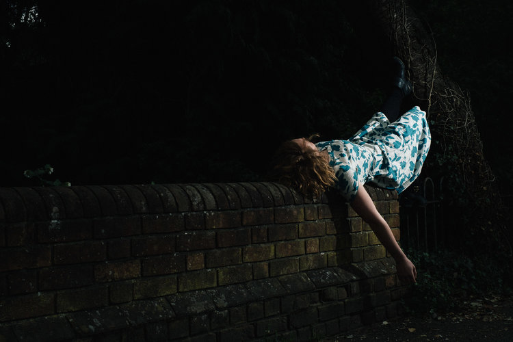
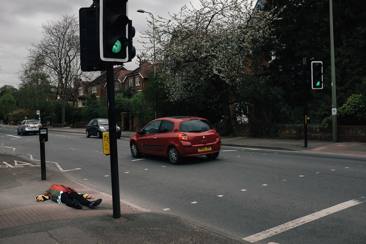
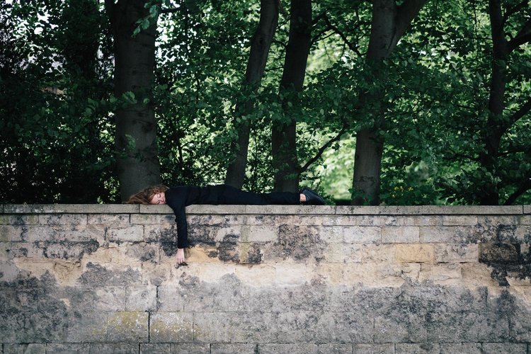
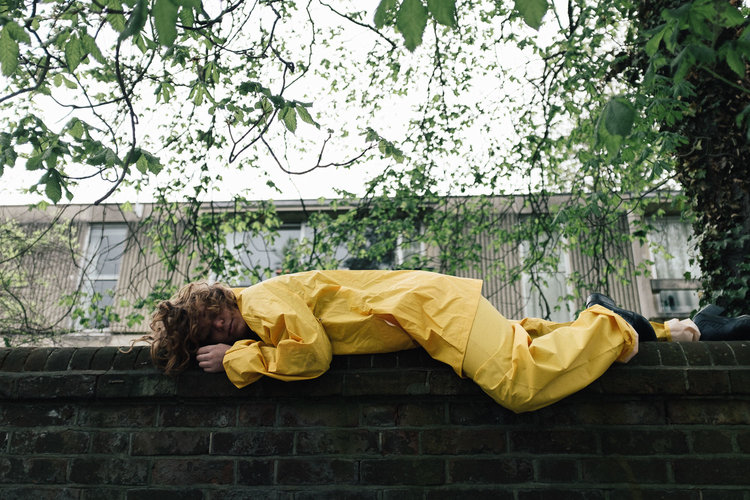
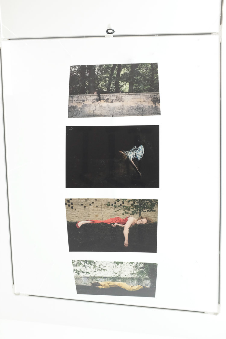
Our project was not about homelessness, but exploring people’s reactions to seeing a figure lying down in public. Ana wanted to provoke a reaction by having a seemingly happy and peaceful figure resting in public, something that is both very rare and carries negative connotations. There was no attempt to scare or shock anyone.
The shoot itself was a simple process. Ana recruited Rachel Gildea and I used a 35mm (my Fuji X100s) or 50mm (my X-Pro 1) lens to photograph the images. I chose both these focal lengths very deliberately as wanted each image to have a surface level of documentary realism with the figure being the one stylised or ‘other’ element in the picture. Both 35mm and 50mm are classic documentary focal lengths that lend themselves to a natural image. A couple of images were lit with a bare Yongnuo speedlight to provide an extra sense of stylisation where I thought it worked. This sense of faux documentary photography with fashion-esque elements such as the out of place figure and Rachel’s eccentric costuming really worked for this series.
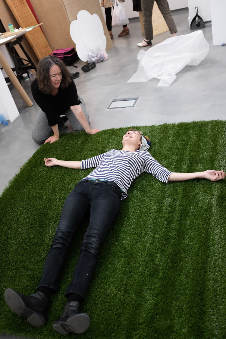
When it came to exhibiting Lying Down, Ana had the most genius idea of hanging the images from the ceiling facing down, rather than against the wall, meaning that the audience has to lie down in the middle of the gallery in order to view the work. As there is no hanging system in the roof of the gallery I needed to figure out a way of printing onto something light enough to be hung from the lighting system. Whitewall in Berlin have a product call Forex which was just the job, lightweight and hardwearing.
The 90cm x 60cm prints from the Fuji files looked absolutely gorgeous. Very film-like with a beautiful matte look to them. The idea that you need an ultra-high megapixel camera to create large prints is just nonsense. If we had wanted to we could have easily made larger prints than these and the would have looked amazing – and this is with the older 16mp Fuji cameras. The newer models will be even be better.
Following an idea from conception to exhibition is a huge joy for a photographer. So many of my images are consumed digitally that when I get the chance to work for exhibition I bound towards it. Seeing your work in the form of printing is so valuable, not just in terms of the ego boost, but also instructing you in why images work and why they don’t. You learn and you work, and then you do it again.
The view from the floor.
If as a result of reading this you have felt that you like to help out homeless people please consider a donation to the sterling people at Crisis: www.crisis.org.uk
Guest Post by Josh Tomalin – Website – Instagram – Facebook – Twitter


