The Perfect Fujifilm X100F Designed According to FR-reader Andreas… and It’s OVF-Less!
NEW GUEST POST FEATURE
Write Your Articles Directly On FujiRumors!
Guest Post by Andreas – behance.net
Join the Fuji X100F Facebook Group
My name is Andreas and I am a 3d artist from Sweden. I work in the video game industry and like to design and visualize things in my spare time. I love photography and cameras so this made me think of what the perfect compact travel/street camera would be like.
The one camera and one lens concept is a popular one these days. For me it started with the X100 and later the X100T. I really like the form factor and rangefinder styled body but always found some things annoying to work with so I decided to make my own X100F camera.
Here are the main changes I made to the design of the X100F:
Lens
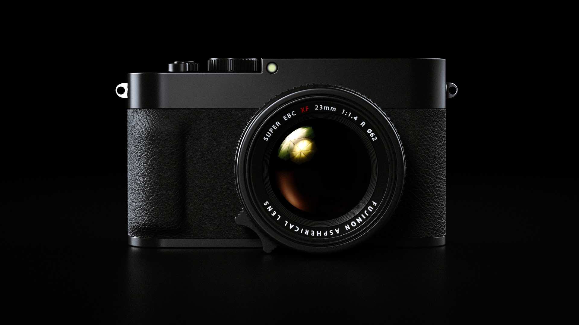
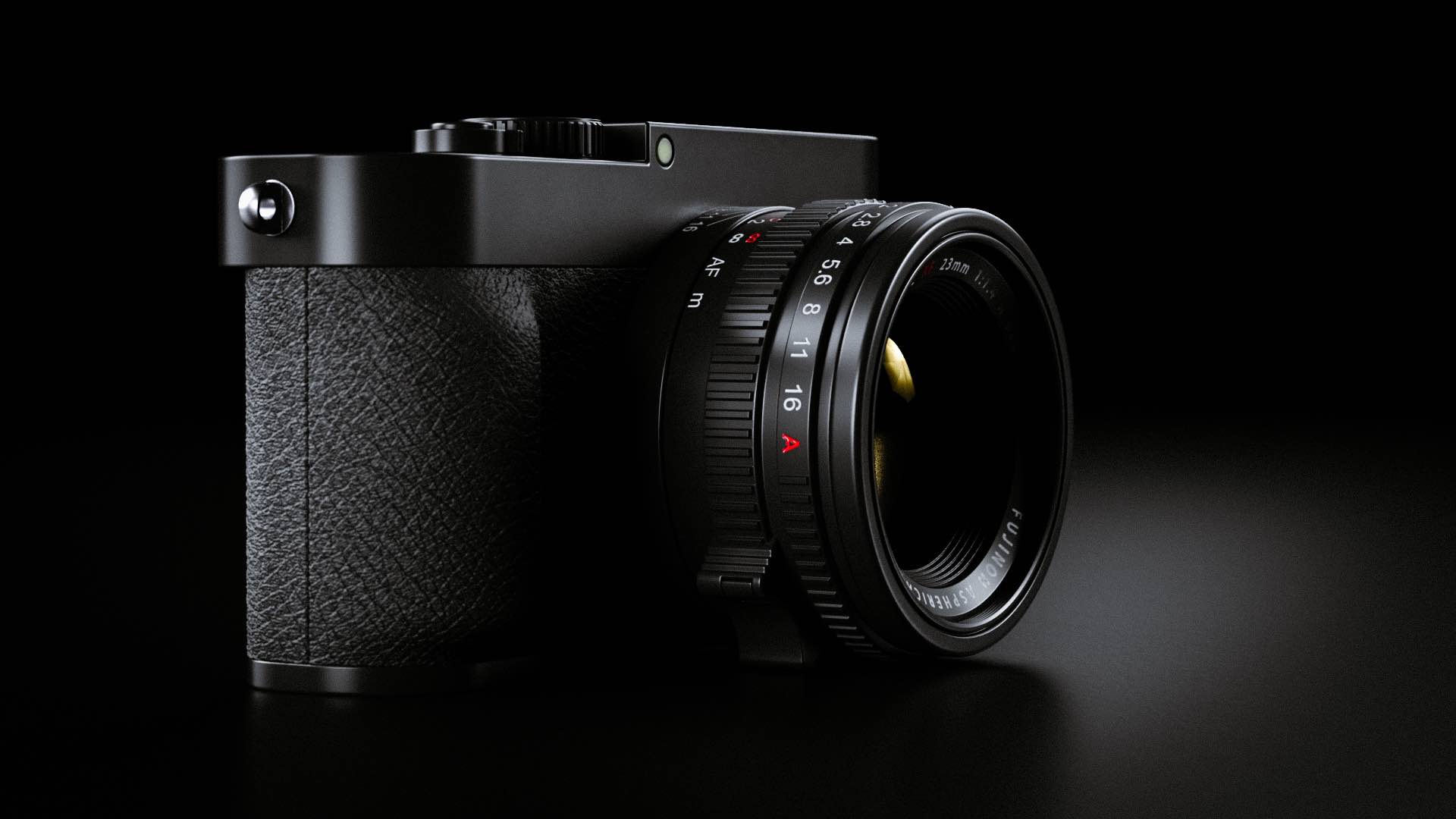
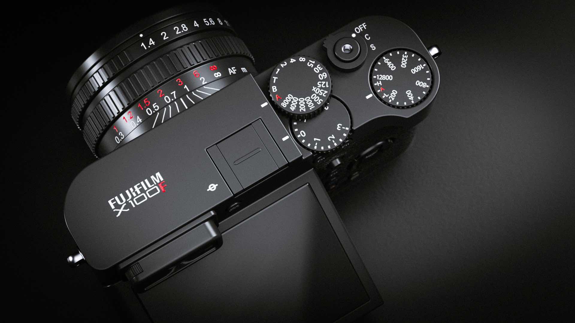
The X100 cameras are not tiny and pockatable and for me I always kept them in my bag anyways. Therefore I think the lens can easily be a bit larger without sacrificing portability. This makes it possible to make a faster and better lens compared to the one in the x100t. It also makes it a better camera ergonomically. I moved the aperture ring up front and added a focus tab on the focusing ring. The focusing has hard stops to make manual focusing a breeze. These changes are inspired by the Leica Q.
Viewfinder
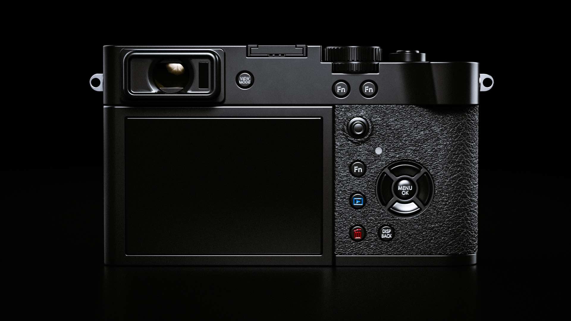
This will probably be the most controversial change I have made to the camera. I removed the OVF. Dear lord, how dare you?! Well I like the less is more approach and I never used the ovf anyway. I find it misses focus too often and it’s basically useless for manual focusing. There I removed it to make the front of the camera cleaner and reduce the parts and cost of the camera overall. I imagine the viewfinder being larger, more high res and faster updating then before.
Grip
I added a built in thumb grip so that we can free up the hot shoe from third party thumb grips. I also added a grip up front inspired by the xt1. This will help ergonomics alot without adding bulk to the camera.
ISO dial
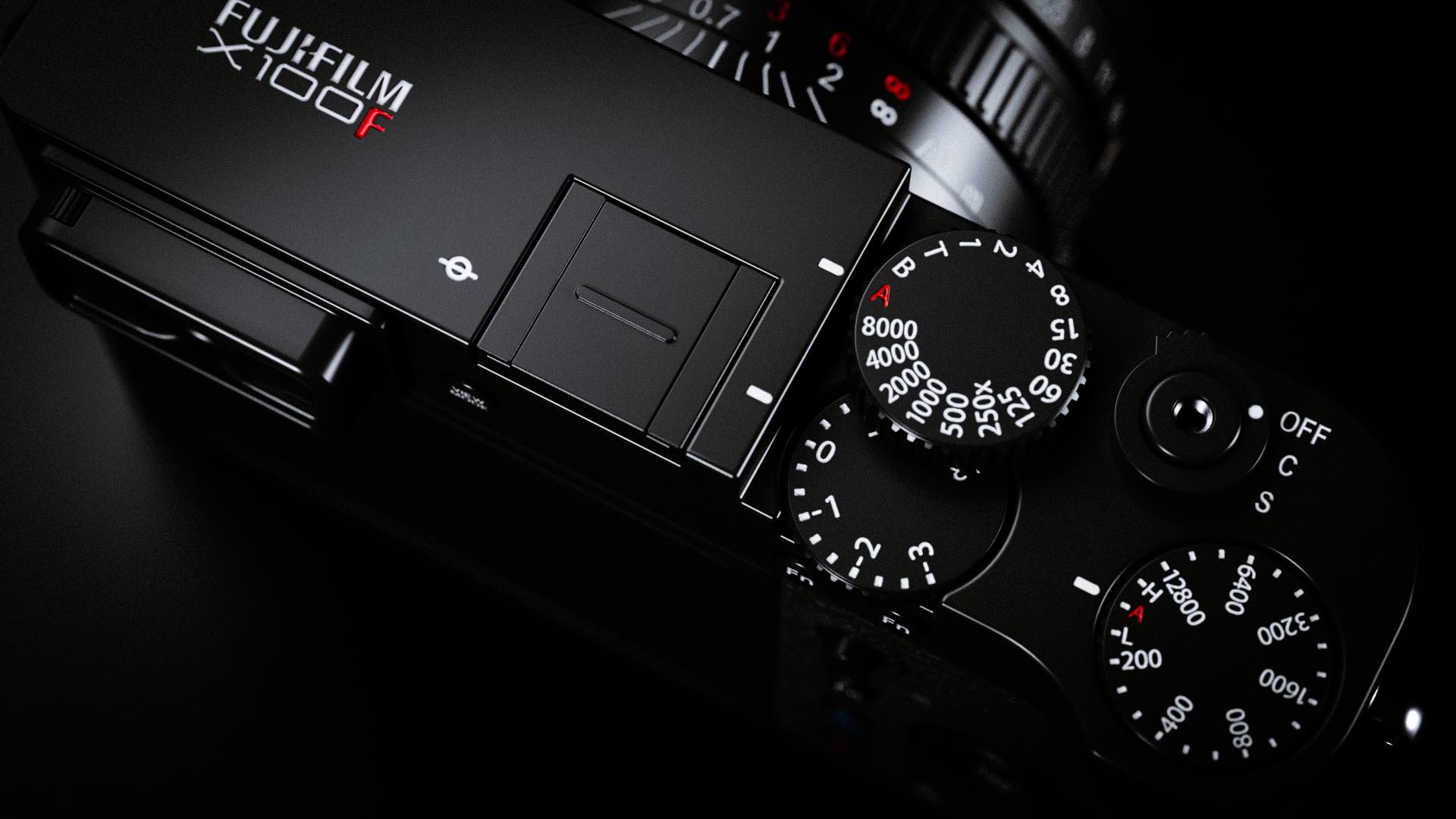
Making the thumb grip built in adds some space up top for another dial. This iso dial is a pop up one so that it doesn’t get in the way of the shutter release while shooting. I took this idea from the Hasselblad X1D.
Compensation dial
I moved the compensation dial to fit it closer to the thumb. It is cleverly positioned underneath the shutter speed dial to save space.
Drive mode
I incorporated the drive mode in the on off switch like on Leica cameras. Saves spaces and is intuitive to use. I placed the “S” mode at the end of the dial for easier turn on since that is the mode that I use most often.
AF joystick
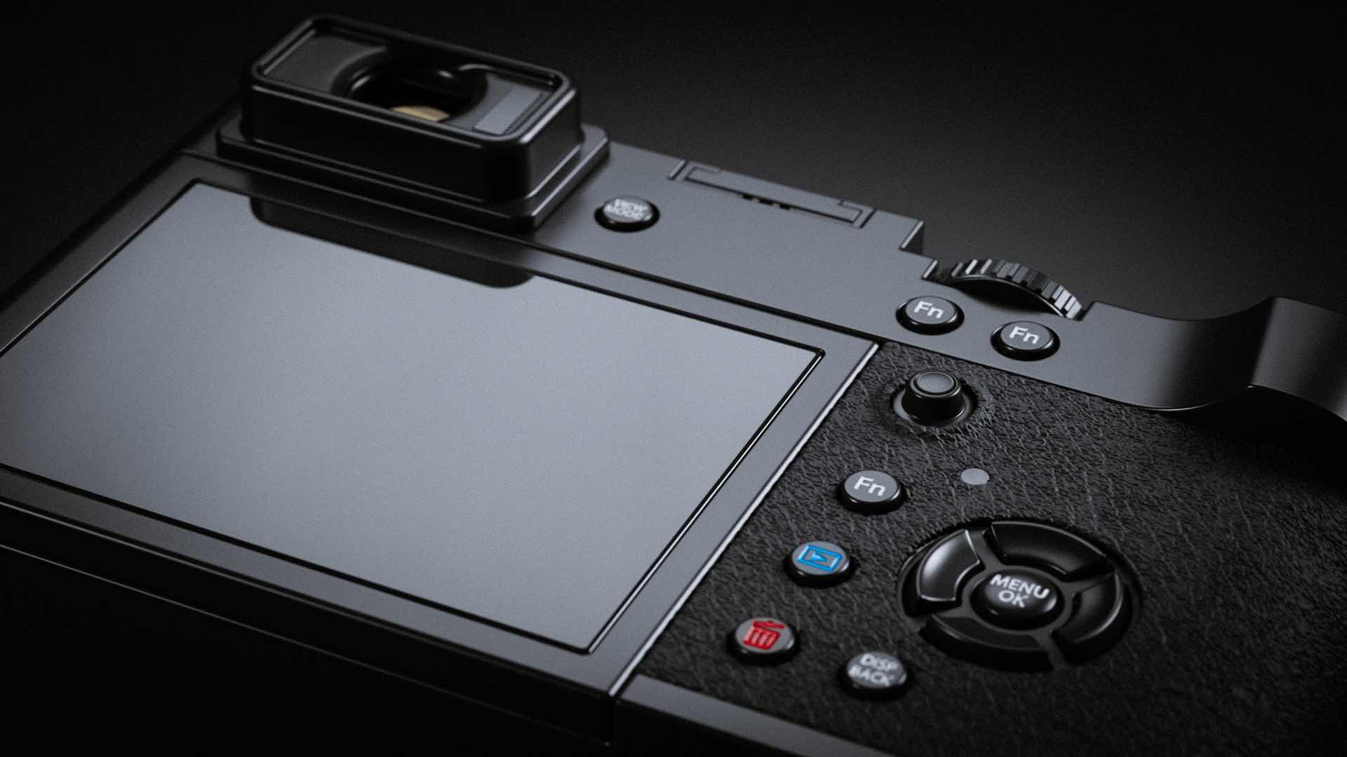
This needs to find its way to all cameras. It makes shooting so much faster.
Tilting screen
I have included a tilting touch screen to the camera and made it flush with the body.
Button layout
All buttons now reside to the right of the screen to make it easier to handle.
That’s it! Remember that this is only how I envision the perfect x100 camera and it will certainly not resonate well with all people. Hope you enjoy the pictures!
See all pictures at behance.net
Push READ MORE to see ALL IMAGES
